In our new ‘Insiders’ series, we are speaking to interiors and hospitality experts who are sharing their tips, advice and inspiration themed around niche topics. For the first in this new series, we caught up with designer and colour consultant, Emma Diaz about how to introduce colour into your home. Emma consults independently and at Edward Bulmer, taking inspiration from nature. She recently launched a collection of eco-conscious sustainable furniture, designed in her Cotswolds cottage and crafted in Wiltshire. Discover more about Emma on her website and Instagram.

Think about which colours make YOU happy – not what is currently on trend.
If you are introducing colour into your home for the first time, spend a while thinking about how you would like the space to feel. Would you like a sitting room to feel cosy or fresh? Do you want your bedroom to be relaxing or romantic (or both!)? Colour can really change the mood of a space, but also our mood. You are the one who will live with your chosen colours every day, so think about how you want to feel in the rooms you are decorating, and choose colours that you genuinely like and will continue to enjoy.
Learn to understand the natural light in your home.
How does the light change throughout the day? Does the light feel cooler in the mornings and warmer in the evenings, for example? Do you have low ceilings or huge windows? This will all affect the colours that you choose and how they are represented in the light of your home. If you have a darker space and want the space to feel warm, you’ll need colours with warmer undertones, and if you have lovely light spaces you can afford to keep it fresher if you like.

Ease yourself into colour with a slightly deeper neutral.
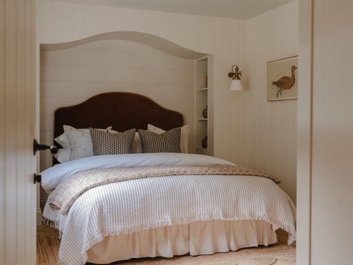
Rather than choosing white, look for a deeper off-white or a soft neutral with undertones to suit the natural light of your house. There are neutrals and whites which are warmer or cooler. I believe many lighter shades of different colours can also be seen as a neutral, creating a backdrop that works with all the different aspects in your home. In my opinion, some of the best neutrals are earthy pinks and lighter browns, and also any tones that contain warmer reds or yellows.
Bring colour into your home through fabrics and furniture.
This is where the scheme comes to life! I see paint as a backdrop pulling everything together, and have used fabrics and furniture to bring colour into my own home. At the time that I was decorating, I loved colour but couldn’t work out how much of it I wanted in the cottage, so I kept adding colourful fabrics on cushions, rugs etc. to test how I felt around the colours. For example, I knew I loved red but didn’t want to paint a wall red! It’s also one of the reasons I created my sustainable painted furniture line, ‘The Westridge Collection’ - to allow people to introduce a little colour through furniture, whether it be a bold statement piece or something more subtle.

Take into consideration everything you already have in a room.
Look at the accessories, furniture, lighting etc. that you already own, and pull colours from these pieces. I also think about how the colours work from different viewpoints in the house and adjoining rooms. It’s a very considered process for me!
Work tonally to pair different colours together
If you pick a light green, maybe pair it with a pale pink on the same tonal scale, rather than a deeper pink. Another more in-depth way of thinking about it is within the undertones. So, for example, if you use a warm blue with a hint of yellow pigment in, make sure you use another colour with that warmer pigment in to pair it with. In our kitchen, I was working with existing pale green cabinetry and picked a warm, yellow on a similar tonal scale to work with it.

Mix neutral and bolder colours together.
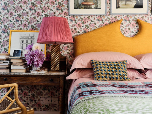
I’ve done this in a few different ways. The first is on our landing space where I used a beautiful floral wallpaper by Tess Newall with a pale pink neutral backdrop. To work alongside this, I used Red Ochre by Edward Bulmer Natural Paint on the woodwork, taking it up onto the architraves to literally ‘frame’ each room. I’ve used a warm neutral on the walls and ceilings in our bedroom to work with this too. The second way is our living room. I used Cinnamon by Edward Bulmer which to me is another warm neutral because it can literally be paired with any colour. I have created a fun, eclectic look in here and used bolder colours on furniture and fabrics through my own Westridge Bookcase, a yellow armchair and a beautifully made, colourful Afghan rug I bought from a market in Provence. It’s a very happy, cosy space!
Red Ochre is probably my favourite colour in my own home.
It’s a very gentle, muted red in comparison to some of the other reds on the market and is a joy to live with. Cinnamon is another of my favourite thanks to its versatility, and I’ve used it in many client’s homes too. I do also love our pretty pink bathroom, which is painted in Cuisse De Nymphe Emue - all Edward Bulmer natural paints.
Discover more about Emma on her website and Instagram.
Discover our blue edit and green edit.
Discover Rebecca's Favourites


